Need to compare two different heights? Look no further than a height comparison chart, a simple yet powerful visual tool designed to make height differences easy to understand at a glance. Whether you’re comparing people, objects, buildings, or even fictional characters, a height comparison chart offers a quick, accurate, and free way to visualise differences. By following a few straightforward steps, you can create your own height comparison chart online without any technical skills or design experience.
Height comparison charts are widely used for personal curiosity, educational purposes, design planning, health tracking, and even entertainment. Instead of relying on numbers alone, these charts convert measurements into clear visuals that instantly communicate scale and proportion. This makes them especially useful for users who prefer visual learning or need fast comparisons without complex calculations.
Start by Gathering Sample Subjects and Their Heights.
The first step in creating an effective height comparison chart is gathering your sample subjects and their accurate height measurements. Sample subjects can be people, children, adults, athletes, family members, or any objects you want to compare. The key here is accuracy, as even small measurement errors can affect the reliability of your final chart.
To measure height correctly, it’s best to use a stadiometer, which is commonly found in clinics and schools. However, if a stadiometer is not available, a standard tape measure can work just fine. Make sure the subject stands straight, barefoot, with heels against a wall and eyes looking forward. Measure from the floor to the top of the head and record the measurement carefully.
Once you’ve gathered all the heights, write them down in a structured format, either on paper, in a spreadsheet, or directly into a height comparison chart template. Keeping your data organised from the beginning will make the next steps much easier and help prevent mistakes.

Measure Out Set Increments for Comparisons.
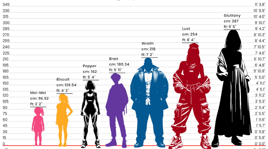
To make your height comparison chart easy to understand, it’s important to use set measurement increments. This means dividing heights into fixed units such as feet and inches or centimetres and meters. Consistency is essential, never mix measurement systems within the same chart.
Using set increments allows viewers to instantly recognize differences without having to mentally convert numbers. For example, if one person is 6 feet 5 inches tall and another is 5 feet 7 inches tall, the chart visually highlights the 8-inch difference in height. This approach is far more intuitive than reading numbers alone.
Uniform scaling also ensures fairness and clarity. Every subject on the chart should be measured using the same scale, spacing, and proportions. This consistency enhances accuracy and prevents visual distortion, making your height comparison chart both professional and reliable.
Use an Online Graph Maker to Create an Accurate Chart.
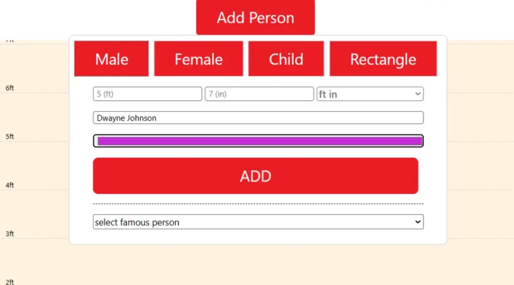
One of the easiest and fastest ways to create a height comparison chart is by using an online graph or chart maker. These tools are user-friendly and require no advanced technical knowledge. Most online tools allow you to input height values and automatically generate a visual comparison within minutes.
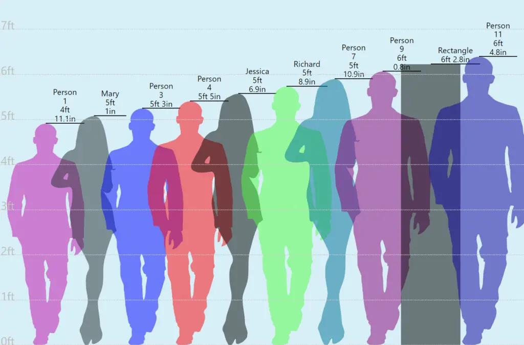
To create your chart, simply enter the heights of your subjects side by side. The tool will then display vertical bars, silhouettes, or lines that represent each height. Some tools even allow you to compare more than two subjects at once, making them ideal for group comparisons.
The biggest advantage of using an online graph maker is accuracy. Since the scale is calculated automatically, you don’t need to worry about uneven spacing or incorrect proportions. Additionally, many height comparison tools provide instant previews, allowing you to adjust measurements and layouts in real time until the chart looks exactly right.
Add Labels and Color Code the Graph to Make It Easier to Read.
Once your height comparison chart is generated, customization is the next step. Adding labels to each subject makes the chart much easier to understand. Labels can include names, ages, genders, or any relevant details that help viewers interpret the data correctly.
Colour coding is another powerful visual enhancement. By assigning different colours to each subject, you make the chart more engaging and easier to scan. For example, you can use one colour for adults, another for children, or different colours for male and female subjects. Colour contrast helps viewers instantly distinguish between heights without confusion.
You can also add grid lines, measurement markers, and reference points to improve clarity. A well-labelled, colour-coded chart not only looks more professional but also improves accessibility for users of all ages.
Review and Refine for Accuracy
Before publishing your height comparison chart, take a moment to review it carefully. Double-check all measurements to ensure accuracy. Verify that labels match the correct subjects and that the scale is consistent throughout the chart.
It’s also helpful to view the chart from a user’s perspective. Ask yourself whether the height differences are easy to understand at first glance. If something looks confusing or cluttered, make small adjustments such as increasing spacing, simplifying labels, or reducing unnecessary elements.
Refining your chart ensures that it communicates information clearly and avoids misinterpretation.
Publish Your Graph and Share It with Others!
Once your height comparison chart is complete and polished, it’s time to share it. You can publish your chart on a website, blog, or educational platform, or share it directly on social media. Height comparison visuals are highly shareable because they are informative, engaging, and easy to understand.
Sharing your chart allows others to benefit from your work and gain valuable insights into height differences. It also opens the door for feedback, which can help you improve future charts.
Many online tools allow you to share your visual simply by copying the generated URL, making distribution quick and effortless.
Whether for learning, curiosity, or presentation purposes, a well-designed height comparison chart is a practical and visually appealing way to communicate size differences clearly and effectively.
FAQs – Frequently Asked Questions
What is a height comparison chart? A height comparison chart is a visual tool used to compare the heights of people, objects, or structures side by side.
Why should I use a height comparison chart? It helps you understand height differences quickly and clearly without relying only on numbers.
Who can use a height comparison chart? Anyone can use it, including students, parents, designers, teachers, and researchers.
What can be compared using a height comparison chart? You can compare people, children, adults, objects, buildings, or fictional characters.
How do I measure height accurately? Measure from the floor to the top of the head while standing straight, barefoot, against a wall.
Which measurement units should I use? Use one consistent unit system, such as feet and inches or centimetres and meters.
Can I create a height comparison chart online for free? Yes, many online tools allow you to create height comparison charts for free.
Do I need technical skills to make a height comparison chart? No, online tools are easy to use and require no design or technical experience.
Why is consistent scaling important? Consistent scaling ensures all height differences are accurate and easy to understand.
Can I share my height comparison chart? Yes, you can share it on websites, blogs, or social media using a simple link.