The Height Difference Visual Comparison Chart helps you see how someone taller or shorter than you might look clearly and engagingly. This visual tool offers a simple and entertaining method to understand height differences instantly, without relying on guesswork or complex measurements.
Explore the many benefits of using this chart, along with helpful tips to achieve the most accurate and enjoyable results. Whether driven by curiosity, fun, or practical comparison, the Height Difference Visual Comparison Chart makes visualizing height differences easy, clear, and engaging.
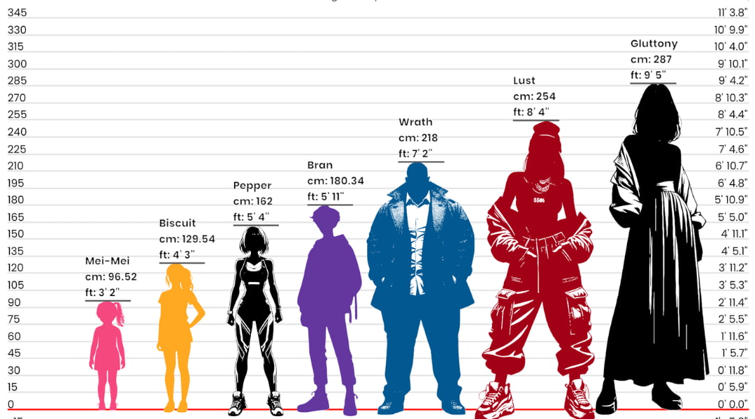
What Is a Height Difference Visual Comparison Chart?
A height difference visual comparison chart helps turn numbers into clear, easy-to-understand visuals. Instead of imagining measurements, you can instantly see how different heights relate to one another. This makes comparisons more meaningful, whether you are comparing individuals, groups, or larger data sets across regions and cultures. By presenting height data visually, the chart simplifies understanding and makes comparisons more engaging.
Understanding Height Differences Through Visualization
Visual comparison charts make it easy to recognize how small or large a height difference truly is. A few centimeters may seem insignificant when written as numbers, but when displayed visually, the difference becomes far more noticeable and easier to understand. Seeing heights side by side helps turn abstract measurements into clear, real-world comparisons.
This visual approach also improves understanding of proportion and scale, especially when comparing multiple people or groups at the same time. By presenting height differences in a clear and structured way, users can quickly grasp relationships between sizes without needing to analyze figures or calculations.

Comparing Individuals, Groups, and Populations
A height difference visual comparison chart can be used for many types of comparisons. You can compare two friends, family members, or classmates, or expand the comparison to include the average heights of men and women across different countries. This flexibility makes the chart useful for both personal curiosity and educational or statistical analysis.
Exploring Social and Cultural Height Patterns
Height differences often vary by region, culture, and lifestyle. A visual comparison chart helps highlight these patterns in a clear way. By comparing average heights across countries or regions, users can better understand how factors such as nutrition, genetics, and environment influence physical growth.
Benefits of Using a Height Difference Visual Comparison Chart
Using a height difference visual comparison chart makes height comparisons fast and intuitive. It eliminates the need to interpret complex numbers and allows users to understand differences instantly. The chart also helps reveal noticeable gaps between age groups, genders, or populations, making it valuable for both casual use and deeper observation.

Practical Uses in Daily Life
These charts are useful in many everyday situations, from comparing heights within a family to satisfying simple curiosity among friends or classmates. Instead of guessing or debating who is taller, users can see clear visual comparisons that make height differences easy to understand at a glance. This makes the experience more engaging and often more fun, especially in casual or social settings.
In addition, height comparison charts are helpful for tracking growth over time. Parents can monitor a child’s development, and individuals can observe changes in their own height using visual references rather than relying only on written measurements. By showing growth patterns clearly, these charts make it easier to notice progress, understand trends, and keep records in a more intuitive and visual way.
Applications for Designers and Architects
For designers and architects, a height difference comparison chart offers a clear and practical sense of scale. It allows them to visualize how buildings, structures, and design elements relate to human height as well as to surrounding structures. Seeing these relationships visually helps ensure that designs feel balanced, functional, and appropriate for the people who will use the space.
This insight plays an important role in planning public spaces, residential areas, and large infrastructure projects. By understanding height proportions early in the design process, architects can make better decisions about spacing, accessibility, and visual impact. A height comparison chart also helps determine whether a structure should blend naturally into its environment or stand out as a defining feature, leading to more thoughtful and effective designs.
How to Implement a Height Difference Visual Comparison Chart
Creating a height difference visual comparison chart begins with collecting accurate and reliable data from trusted sources. Having precise measurements is essential, as the quality of the data directly affects how clear and meaningful the visual comparison will be. Careful data selection helps ensure the chart reflects real and dependable height differences.
Once the data is gathered, it can be entered into an easy-to-use comparison tool that transforms numbers into clear visual representations. The finished chart can then be shared across websites, presentations, reports, or other digital platforms, making it accessible to a wider audience and easy to understand for users in different contexts.
Tips for Creating an Effective Height Difference Visual Comparison Chart
To make the chart truly effective, consistency and clarity are essential. Using a uniform scale for all measurements helps maintain accuracy and prevents confusion when comparing different heights. A consistent scale ensures that every visual comparison is reliable and easy to interpret.
Applying contrasting colors can further enhance readability by clearly distinguishing between different heights. Adding labels or brief notes where necessary helps users understand the data without effort. By keeping the overall design clean, balanced, and uncluttered, the chart remains simple to read and accessible for all users, regardless of their experience level.

Frequently Asked Questions (FAQs)
What is a height difference visual comparison chart?
A height difference visual comparison chart is a tool that shows height differences visually rather than just using numbers. It helps you quickly understand how tall one person or group is compared to another.
Who can use a height difference comparison chart?
Anyone can use it. It is useful for individuals comparing heights with friends or family, as well as for students, researchers, designers, and anyone interested in height data.
Can I compare multiple people or groups at once?
Yes, most height comparison charts allow you to compare several people or groups at the same time, making it easy to see differences at a glance.
Does the chart support different units of measurement?
Yes, height comparison charts typically support multiple units such as centimeters, meters, feet, and inches, allowing flexible and accurate comparisons.
Is the height data shown in the chart accurate?
Accuracy depends on the data you enter or the source of the information. When reliable and well-researched data is used, the chart provides consistent and dependable visual results.
Can this tool be used for educational or professional purposes?
Absolutely. Height difference visual comparison charts are commonly used in education, research, architecture, and design to understand scale, proportion, and size differences clearly.
Is a visual chart better than numeric height comparisons?
Yes, for many users it is. Visual charts make height differences easier to understand and remember, especially when comparing multiple heights at once.
Can I share the results with others?
Yes, height comparison charts can usually be shared through websites, presentations, or social media, making it easy to show your comparisons to others.