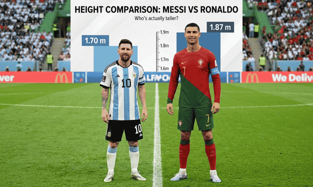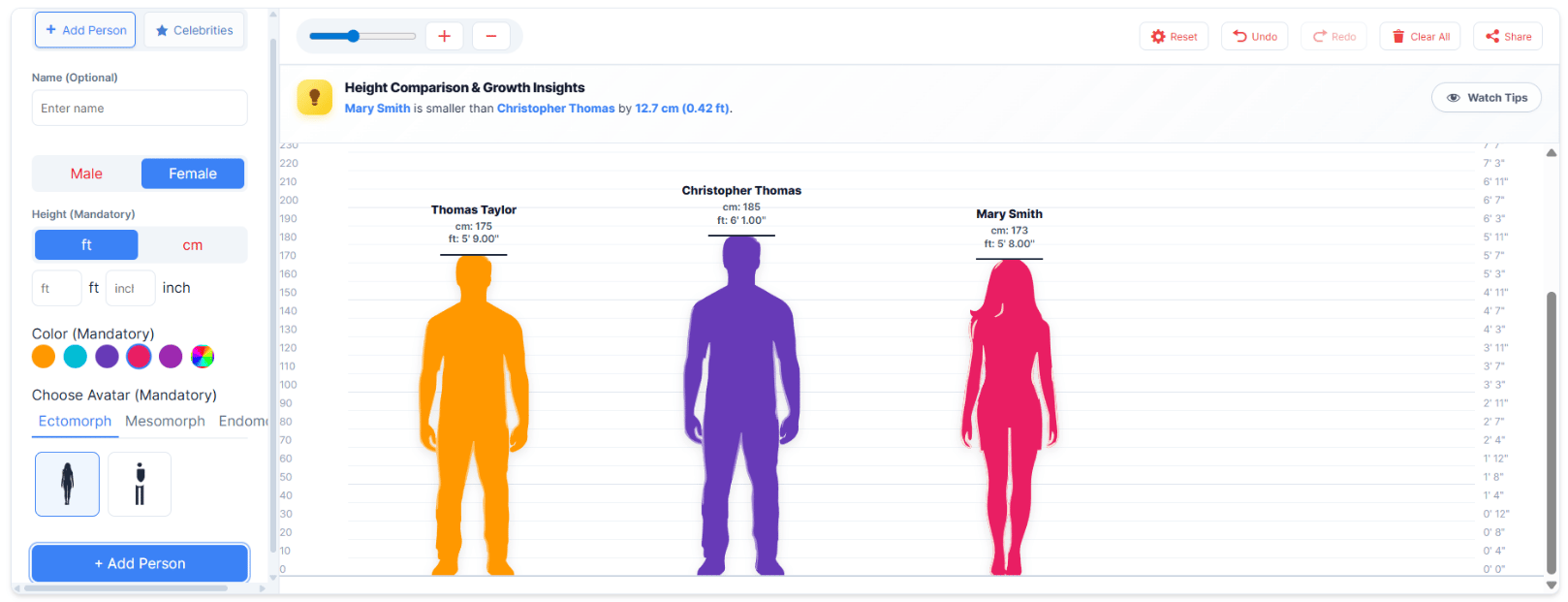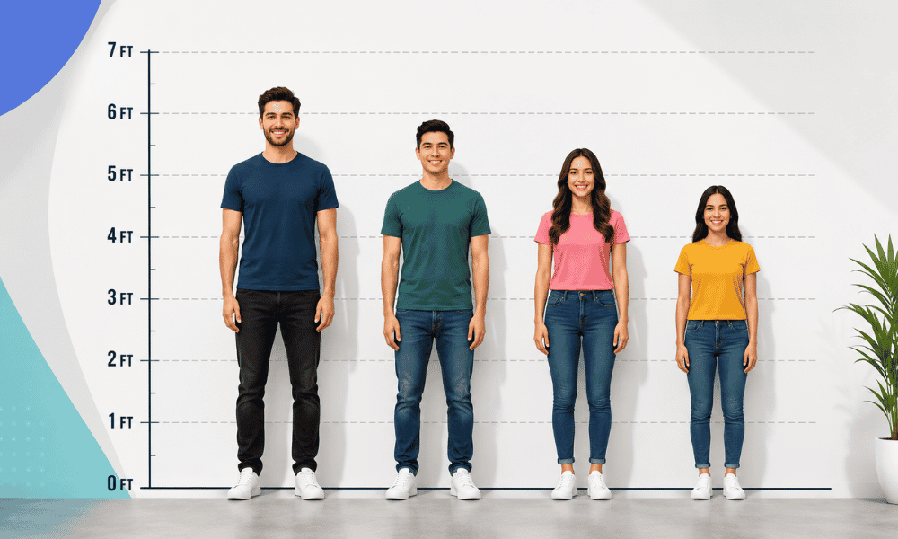
A 2D height comparison is a visual way to show how tall or short different people, characters, or objects are using flat images. Instead of just numbers, it places subjects side by side so viewers can quickly understand size differences at a glance. This simple method is popular online and in education because it makes height comparisons easy, clear, and engaging without needing calculations.
The growing demand for this type of visual content reflects a broader shift toward data visualization in everyday communication. People no longer want to read long paragraphs of statistics when a single image can convey the same information in seconds. A flat, scaled height chart satisfies this need perfectly, making it a valuable asset for bloggers, educators, designers, and content creators who want to present information in a format that is both accurate and visually appealing.
What Exactly Is a 2D Height Comparison?
At its core, a 2D height comparison is a graphic representation where multiple subjects are drawn or rendered at a consistent scale and aligned along a common baseline, typically resembling a measuring chart or ruler. Each subject is depicted as a flat silhouette or illustrated figure, and its relative height is shown proportionally so that taller subjects appear taller and shorter subjects appear shorter, exactly as they would in real life. Unlike three-dimensional models or animations, this flat format relies solely on two-dimensional imagery, making it lightweight, fast-loading, and easy to create with basic design tools.
This approach is especially useful when comparing subjects that would otherwise be difficult to visualize together, such as a person standing next to a skyscraper or a small animal standing beside a large one. By using a proportionally scaled chart of this kind, creators can present scenarios that would otherwise be impossible to convey in a clear and believable way, helping audiences understand proportions that words alone cannot fully convey.
Why This Type of Visual Comparison Matters
The importance of comparing height in a flat, visual format lies in its ability to simplify complex size relationships into something immediately understandable. Human beings are naturally visual learners, and studies on cognitive processing consistently show that people retain and understand visual information far more effectively than text-based data. When a well-designed height chart is used correctly, it eliminates confusion and allows viewers to draw accurate conclusions about scale without prior knowledge of units such as centimeters, feet, or inches.
This is particularly valuable in fields such as education, journalism, entertainment, and marketing, where clarity is essential. A teacher explaining the size differences between historical figures, an entertainment blog comparing anime characters, or a product page showing how an item measures up against a human silhouette can all benefit from this kind of visual chart. In each of these cases, the visual format removes ambiguity and makes the content more engaging, shareable, and memorable.
Common Uses and Applications
The versatility of this visual approach is one of the main reasons it has become so widely adopted across different industries and content niches. In the entertainment world, fans frequently create flat-scale charts to visualize the heights of movie characters, anime protagonists, video game avatars, or celebrities, satisfying curiosity that pure numbers cannot fully address. In education, a similar chart can help students understand historical or biological size differences, such as comparing dinosaurs, ancient structures, or famous historical figures in a way that feels tangible rather than abstract.
E-commerce businesses also rely on this visual style to help customers understand product dimensions before making a purchase. For example, a furniture retailer might use a flat scale illustration to show how a bookshelf or wardrobe compares to an average adult, giving shoppers a realistic sense of scale that product descriptions alone cannot provide. Similarly, architects and interior designers sometimes use a simplified version during early planning stages to communicate building or furniture proportions to clients who may not be familiar with technical blueprints.
Content creators on social media platforms have also embraced this format because it performs well in terms of engagement. Visual comparisons are inherently shareable, sparking curiosity and conversation among audiences who enjoy discovering how their favorite characters or public figures measure up.
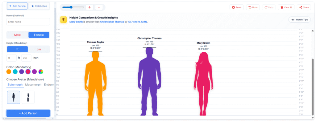
Key Benefits of Using a 2D Height Comparison
One of the most significant benefits of a 2D height comparison is its ability to communicate information instantly. Rather than reading through a table of numerical values, viewers can glance at the image and immediately understand which subject is taller, shorter, or roughly the same height as another. This immediacy makes the format ideal for fast-paced digital environments where attention spans are limited, and clarity is essential.
Another major benefit is accessibility. This type of visual chart does not require specialized knowledge or conversion of measurements, making it equally understandable to people of different ages, education levels, and cultural backgrounds. This universal readability is part of why the format performs so well across international audiences and diverse platforms, regardless of the language used in surrounding text.
From a content creation standpoint, this type of visual is also relatively simple and cost-effective to produce. Unlike three-dimensional modeling, which often requires advanced software and technical expertise, a flat-scale illustration can be created with basic vector graphics, silhouette outlines, or even simple illustration tools. This lowers the barrier to entry for creators who want to produce high-quality visual content without investing in expensive equipment or specialized training.
Additionally, this format enhances search engine visibility when used strategically within blog posts, infographics, and product pages. Visual content tends to increase user engagement metrics such as time spent on page and reduced bounce rate, both of which are factors that search engines consider when ranking content. This makes a well-crafted height comparison chart not only a useful communication tool but also a valuable asset for content marketing and search engine optimization strategies.
How to Create an Accurate Comparison Chart
Creating an accurate visual scale chart requires careful attention to proportion and consistency. The most important principle is maintaining a fixed scale throughout the entire image, meaning that if one unit of height on the chart represents a certain real-world measurement, that same ratio must apply to every subject included. Without this consistency, the resulting visual can become misleading rather than informative, undermining its very purpose.
Designers typically begin by establishing a baseline, often represented as a horizontal line at the bottom of the image, which serves as the ground level for all subjects. From there, each figure or silhouette is scaled according to its actual height relative to the others, ensuring that the tallest subject reaches the appropriate height on the chart while shorter subjects are proportionally reduced. Grid lines or measurement markers are frequently added alongside the figures to reinforce the sense of scale and allow viewers to estimate approximate heights even without reading exact numbers.
Color coding and labeling also play an important role in making this kind of chart easy to interpret. Using distinct colors for each subject, along with clear labels indicating names and exact height measurements, helps prevent confusion when multiple figures are included in a single comparison. Good typography and spacing further improve readability, ensuring that the visual remains clean and professional rather than cluttered. Many designers also add subtle unit markers, such as small tick marks every 10 centimeters or 1 foot, so that even casual viewers can estimate measurements without consulting a separate legend.
Comparison to Other Visualization Methods
While a flat, scaled height chart is highly effective for showing relative size, it is worth understanding how it differs from other visualization approaches, such as 3D models or numerical tables. A three-dimensional version can offer a more immersive and realistic perspective, allowing viewers to rotate and examine subjects from different angles, but it requires significantly more time, technical skill, and computing resources to produce. In contrast, the flat, two-dimensional approach achieves a similar communicative goal with far less complexity, making it a practical choice for creators who need to produce content quickly without sacrificing clarity.
Numerical tables, on the other hand, provide precise data but lack the intuitive visual impact of a 2D height comparison. While tables are useful for detailed reference, they often fail to elicit the same emotional or engaging response as a well-designed visual comparison. This is why many content creators choose to combine both formats, using a flat comparison chart as the primary visual anchor while including numerical data as supporting detail for readers who want more precise information. This hybrid approach tends to satisfy both casual browsers who want a quick visual impression and detail-oriented readers who want exact figures to verify.

Practical Tips for Optimizing This Content Format
For those creating a comparison chart for online publication, a few practical considerations can significantly improve both visual quality and search performance. Ensuring the image file is properly compressed helps maintain fast page load times, which is important for both user experience and search engine ranking. Including descriptive alt text that mentions the subjects being compared, such as character names or object types, helps search engines understand the image’s content and can improve visibility in image search results.
Placing the comparison near relevant, well-written text also strengthens its contextual relevance. Surrounding the visual with a clear explanation of who or what is being compared, along with any interesting facts about the measurements involved, gives both readers and search engines additional context that reinforces the topic. This combination of strong visual content and supporting text is often what separates a highly engaging chart from one that fails to capture audience attention.
Consistency in style across multiple charts also matters to creators who regularly produce this type of content, such as entertainment blogs or fan communities. Maintaining the same color palette, font choices, and layout structure across different comparisons helps build a recognizable visual identity that audiences come to associate with a particular creator or brand. Over time, this consistency can turn a simple visual format into a signature style that readers actively seek out and share with others.
Conclusion
A 2D height comparison remains one of the most effective and accessible ways to communicate size and scale in a visually engaging format. By transforming raw measurements into flat, proportionally accurate graphics, this method allows audiences to instantly understand how different people, characters, objects, or structures relate to one another in terms of height. From entertainment and education to e-commerce and design, the applications of this visual approach continue to expand as more creators recognize its ability to simplify complex information. Its combination of simplicity, accessibility, and visual appeal makes it a lasting tool in the world of digital content creation.